TRACKR MOBILE APP
OVERVIEW
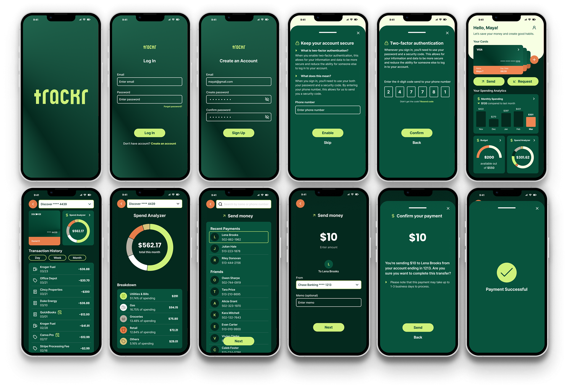
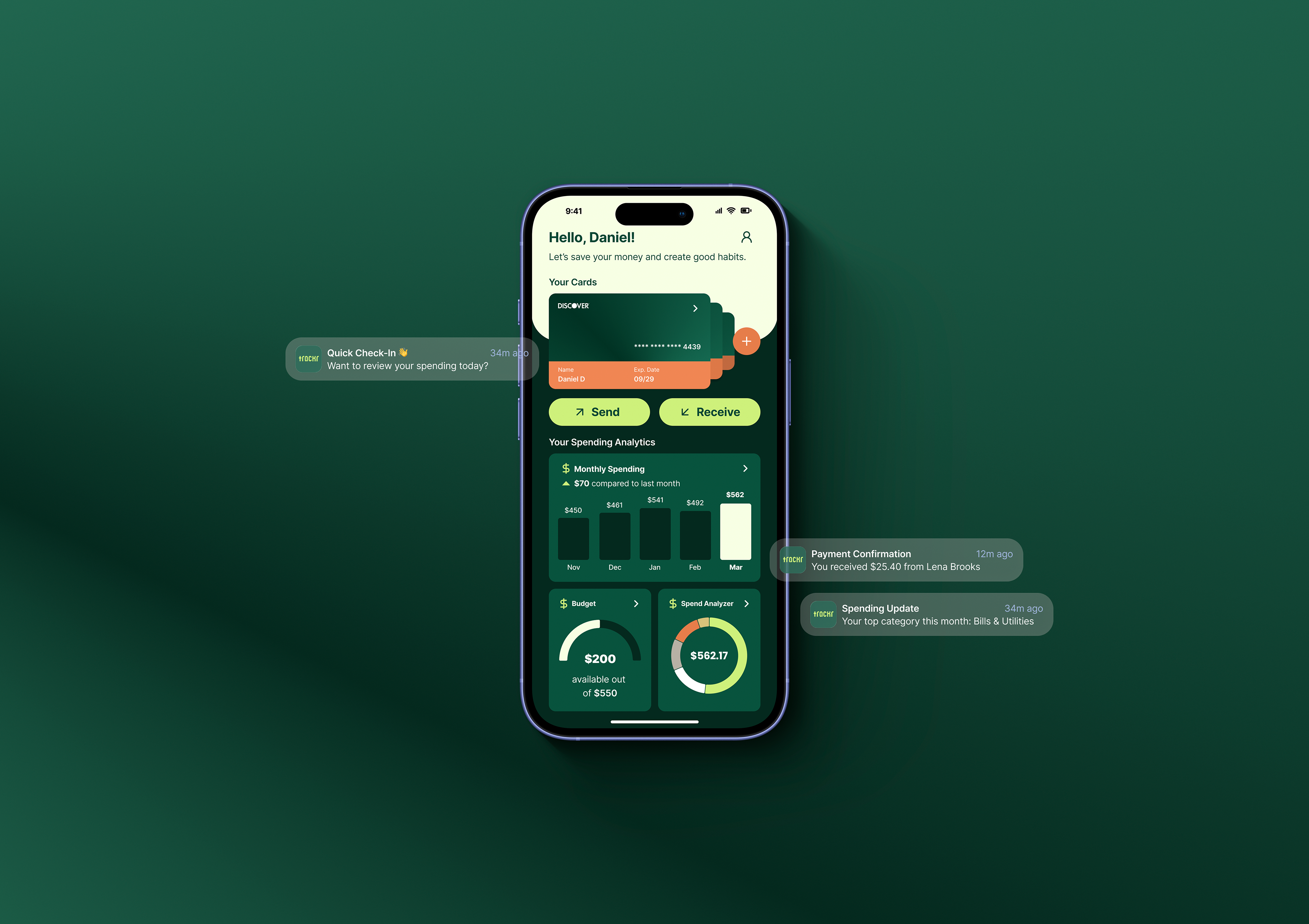
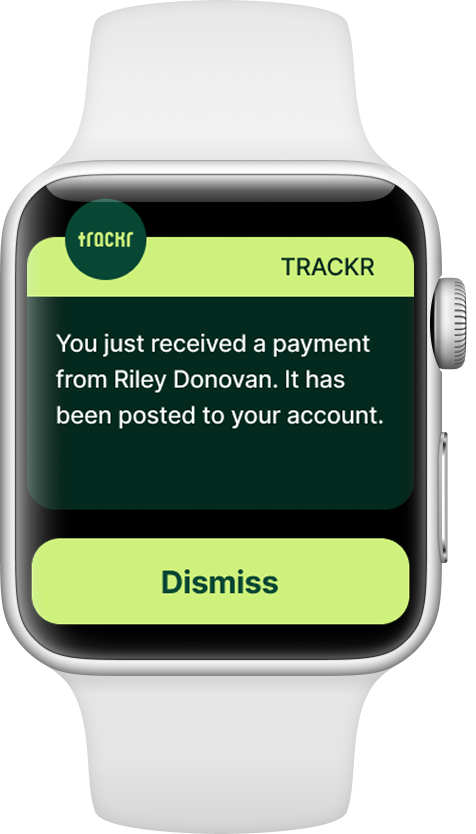
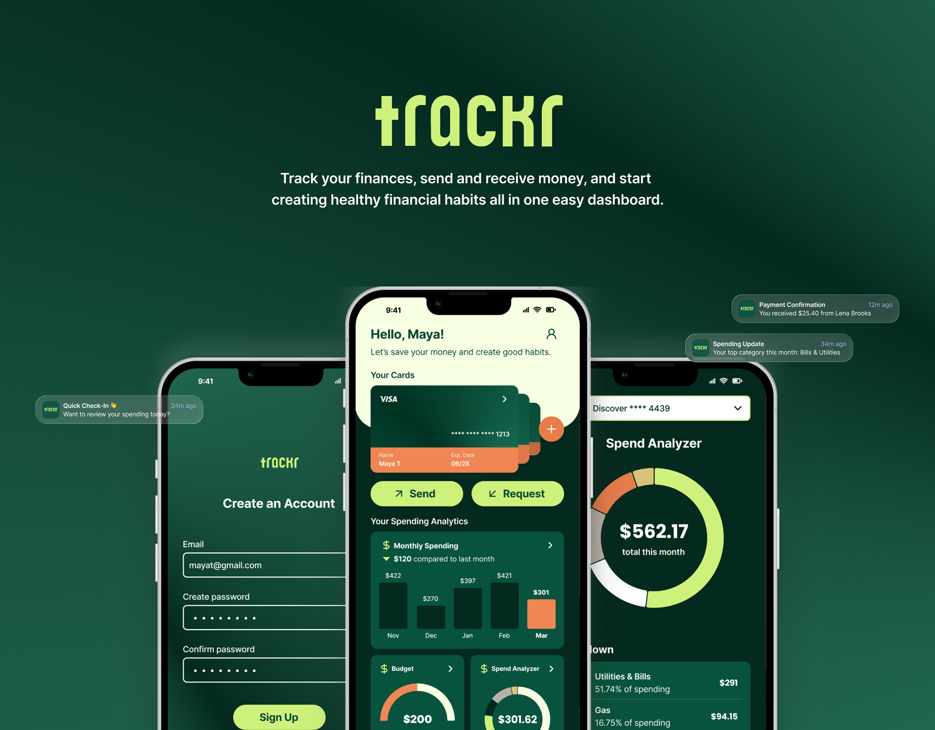
Trackr is a mobile app that streamlines payments, expense tracking, and spend analyzer in one place. Designed for every day use, it allows users to send and receive money, create a budget, view transaction history with ease, and store their cards and bank accounts digitally. The app also features a smart spending analyzer that delivers real-time insights and notifications, helping users stay aware of their habits and make better financial decisions.
MOODBOARD & INSPIRATION
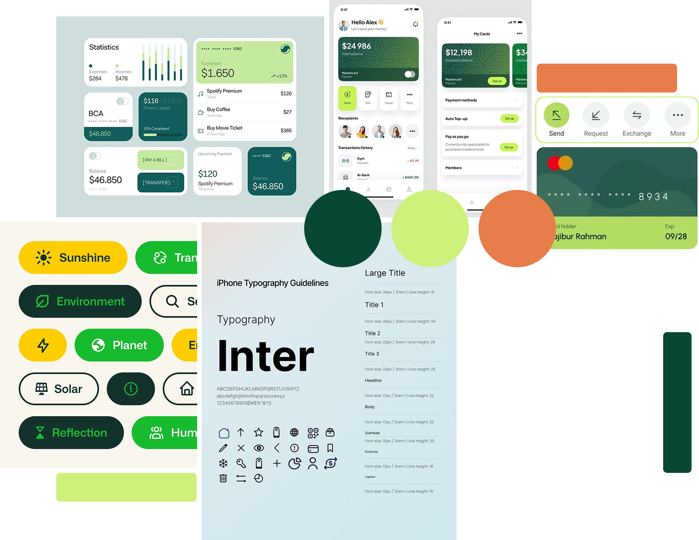
The goal of this app is to create a unified space for users to manage their money and create healthy spending habits. A lot of finance apps use the color blue since it's said to give a sense of trust, peace, and order. Initially, the colors reminded users of a health app, but in a good way. This makes users feel like their creating healthy habits with their money. The color green is associated with growth and new beginnings and indicates safety or success.
PERSONAS
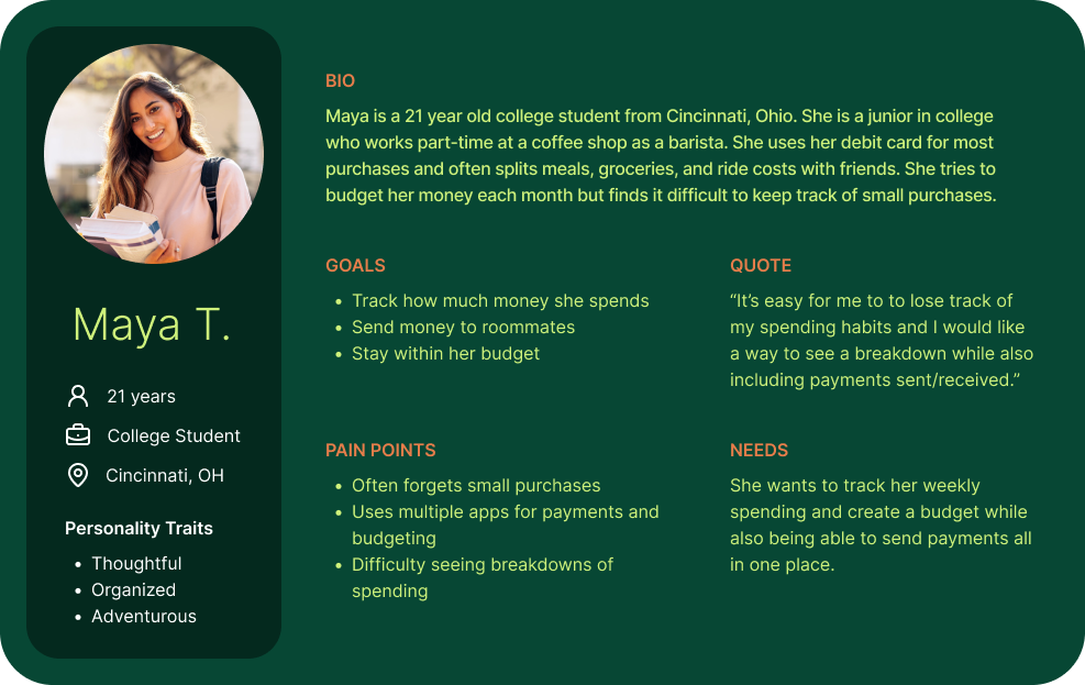
Meet Maya, a college student who splits bills and other payments with her roommates and friends. She's looking for an app to create better financial habits. She would like to see her spending habits and send payments all in one place.
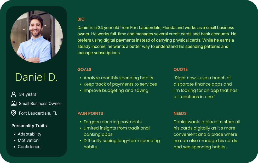
Meet Daniel, a small business owner who manages multiple credit cards and recurring payments. He's looking for an app to be able to see his transaction history and his spending patterns clearly in one place rather than a bunch of disparate apps.
HOW MIGHT WE STATEMENT
How might we enable users to manage and monitor all of their financial activities in a single platform, empowering them to make better-informed decisions?
user flows & IA Pattern
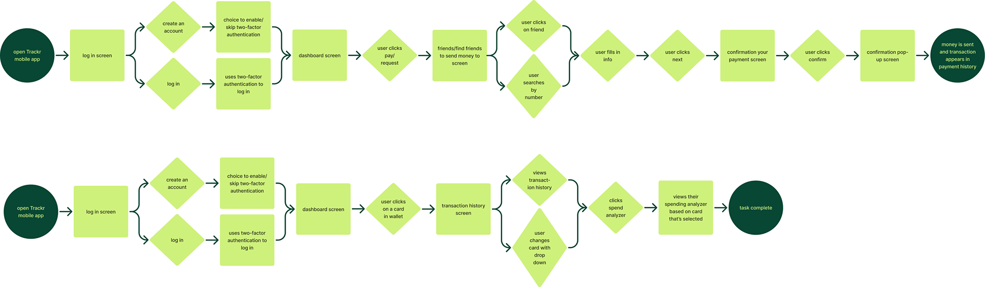
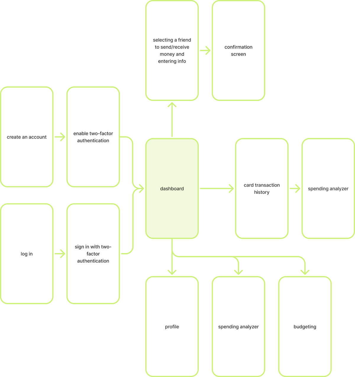
Maya's user flow highlights the processes of onboarding as a new user and sending a payment to her roommate. Daniel's user flow illustrates how an existing user logs into the app to view his transaction history and spend analyzer. The rectangles represent screens visited and the diamonds represent decisions the user makes within the app.
For the IA pattern, the use of Bento Box and Nested Doll were chosen to help the user navigate to all features of the app from the dashboard. The dashboard features the Bento Box pattern while the remaining functions of the app are Nested Doll patterns.
ideation
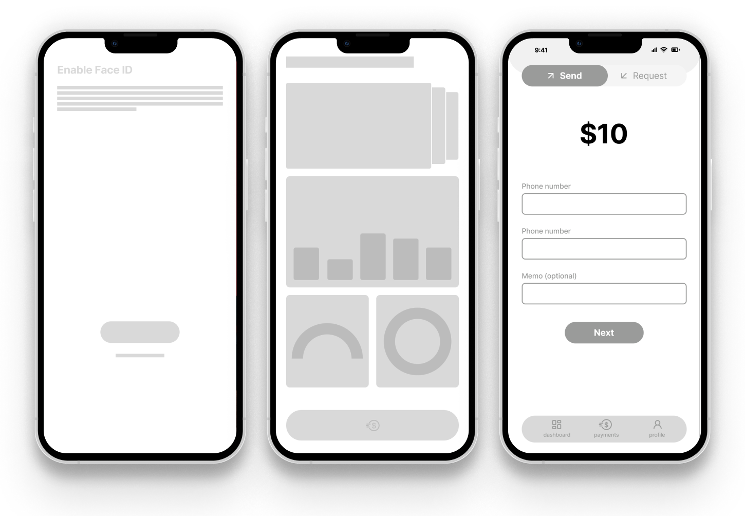
During the initial wireframing process, I received helpful feedback from users that helped further create the app. Since Trackr handles personal information, having an extra step of security such as facial recognition makes the app feel more trustworthy. To make it feel even more secure, there was a suggestion to have two-factor authentication instead. After user testing, it was decided that there was no longer a need for the main navigation bar, and instead, everything could be accessed from the dashboard. Lastly, there needed to be an extra step in the sending and receiving payments process in case the user make a mistake and needed to return to the previous screen. It's an extra confirmation screen.
DESIGN SYSTEM
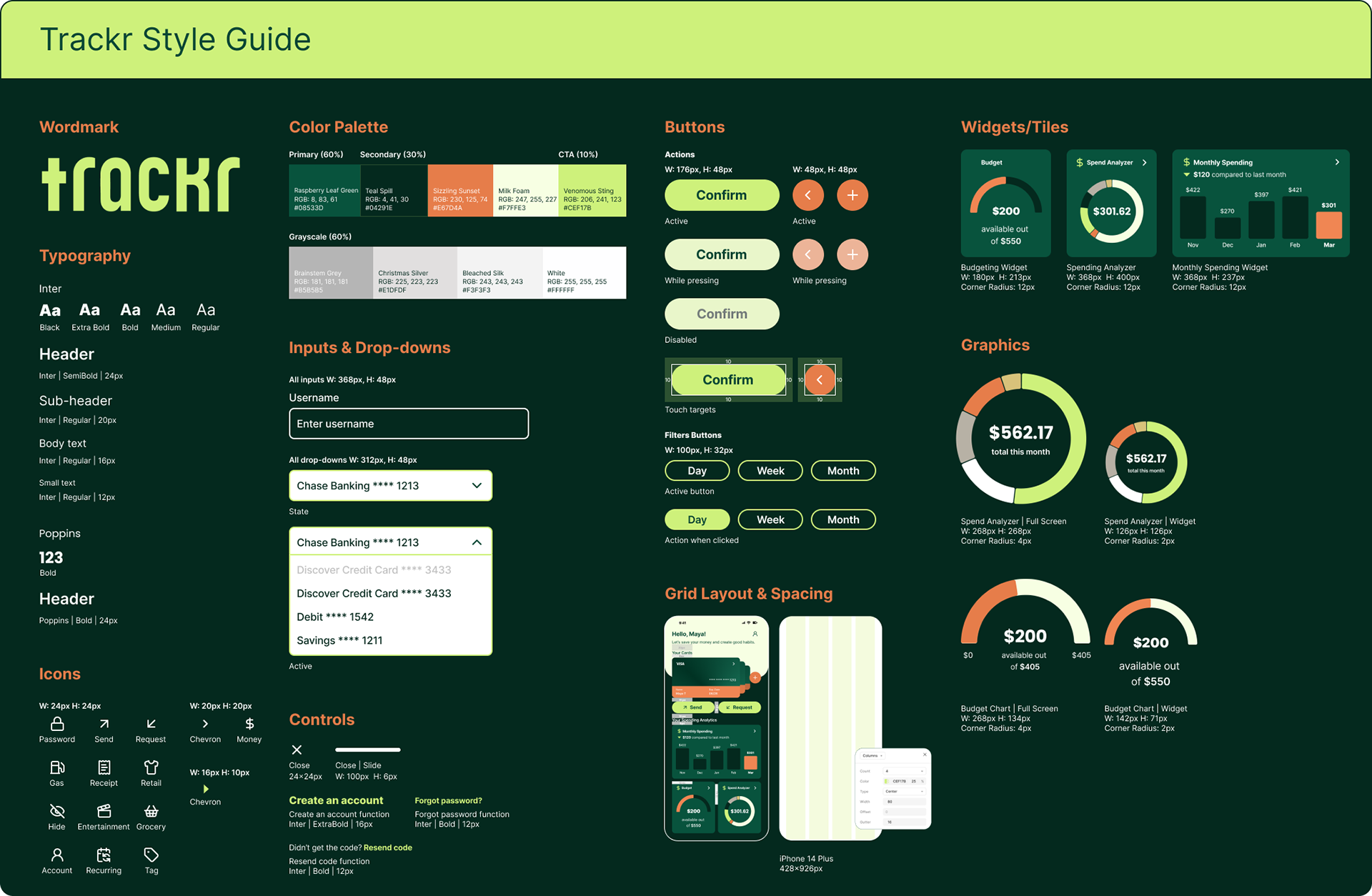
The style guide reflects the look and feel of the app itself with its dark theme and colors. For the wordmark, the goal was to have it reflect the look of the app with its round corners and feel approachable, especially since handling money can be intimidating. The chosen typefaces provide many different weight options and are easy to read on mobile devices.
FINAL RESULTS