ASPEN MOBILE APP
OVERVIEW
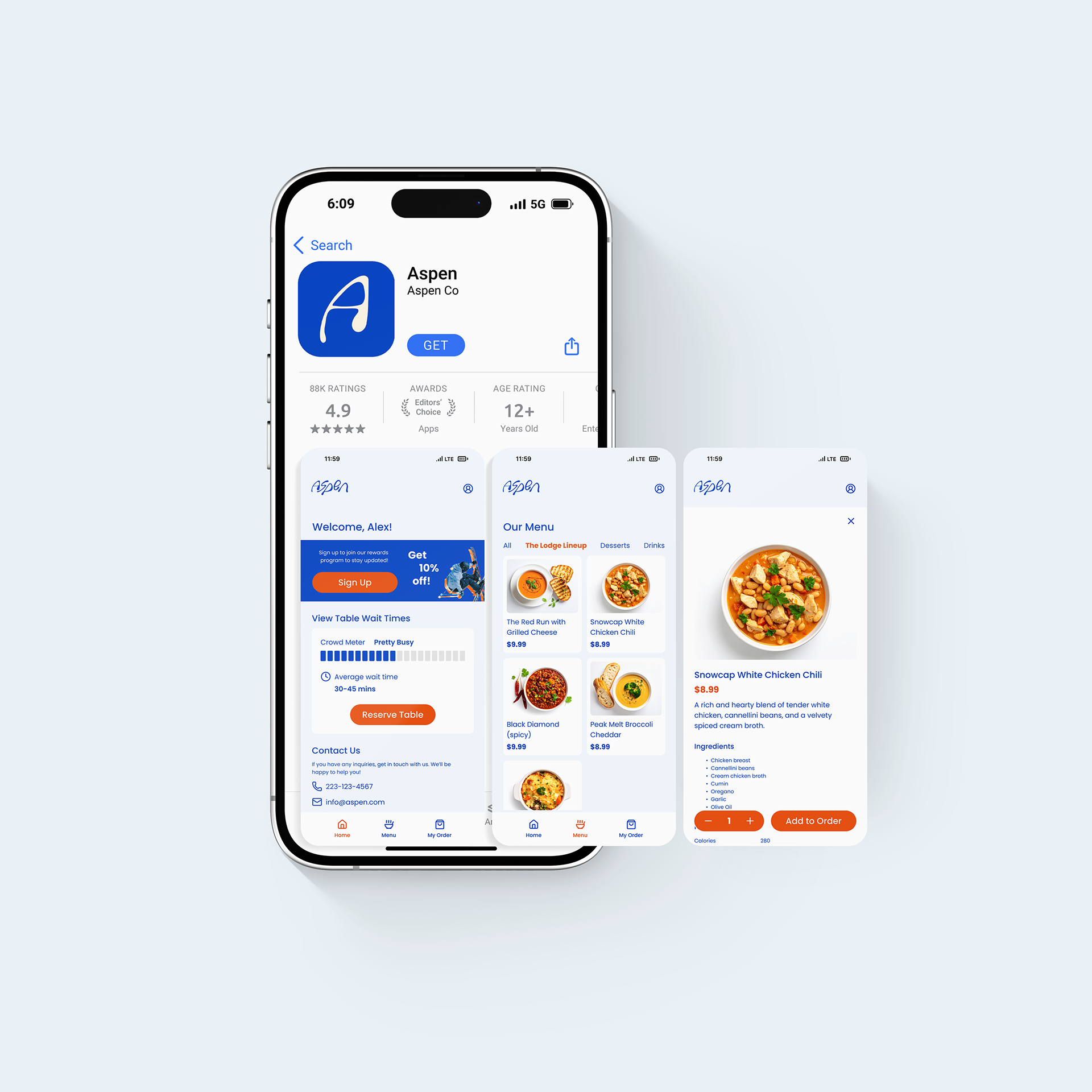
Located on Main St. in Breckenridge, Colorado, Aspen is a soups and chili restaurant. It's perfect for a cold day on the slopes. The app streamlines the ordering process for skiers and resort visitors, allowing them to browse the menu, place orders ahead of time, and view real-time wait statuses. The app prioritizes simplicity and accessability for those who are ready to eat a warm meal after hitting the slopes all day.
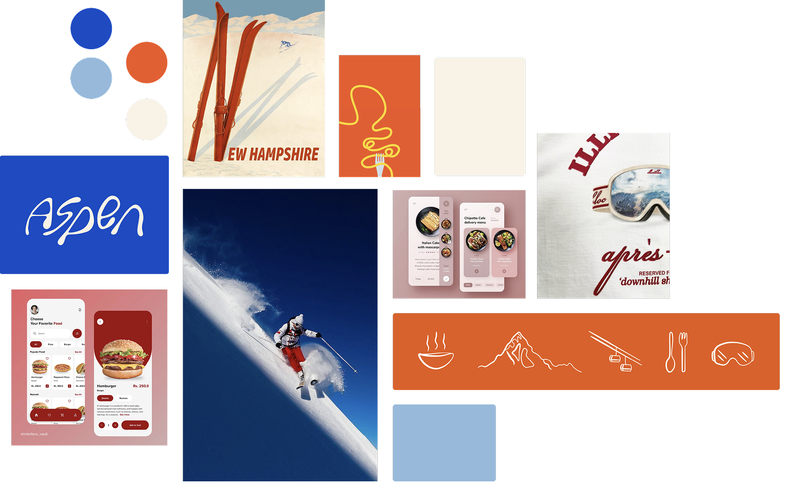
Mood board & inspiration
The terracotta color represents the warm feeling of the foods served at Aspen and the blues represent the cold atmosphere in Colorado. The goal of the UI was to reflect its branding.
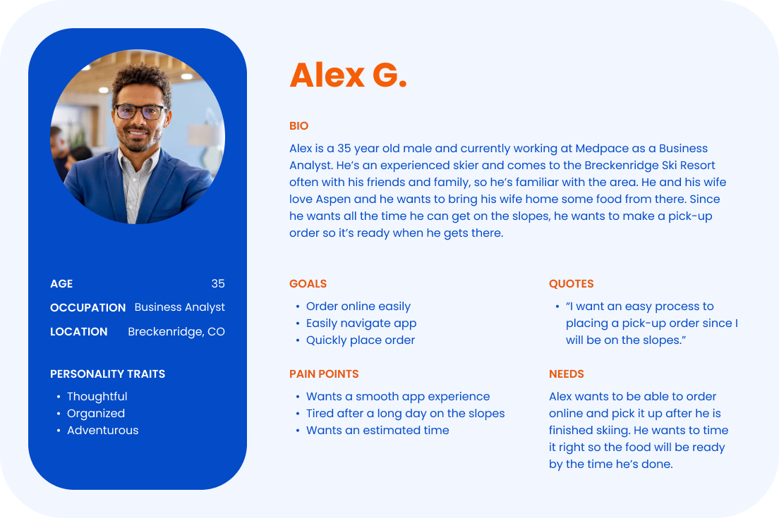
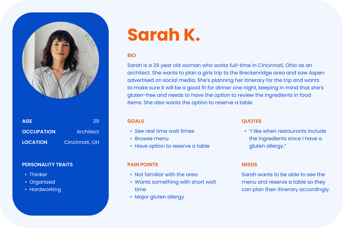
PERSONAS
Alex, a corporate business analyst and experienced skier, knows the area well. He wants a smooth pick up order experience since it's challenging to estimate timing during ski trips.
Sarah, who isn't familiar with the area, is planning an itinerary for her girls' trip. She's gluten-free and wants to be able to view the menu ahead of time before making a reservation.
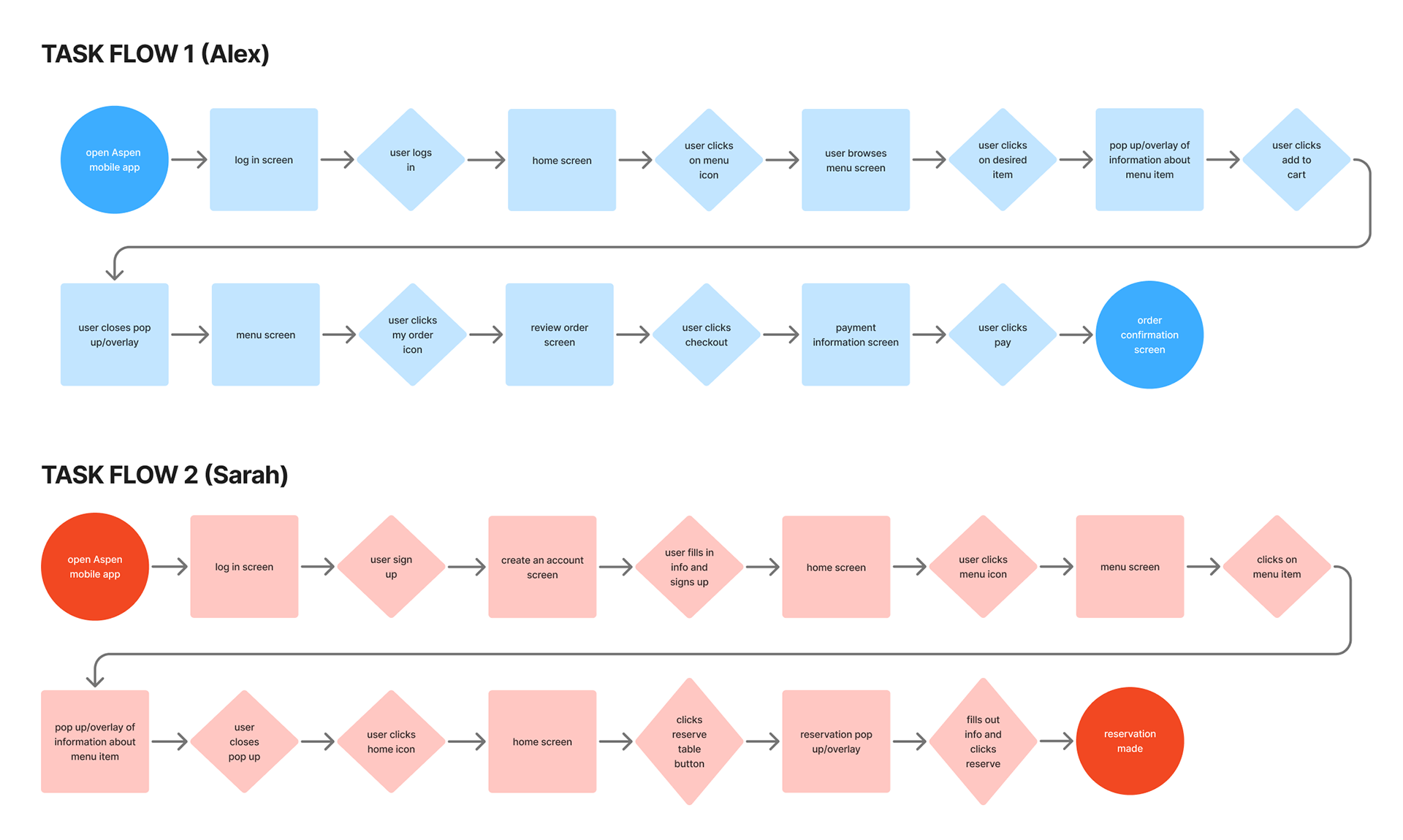
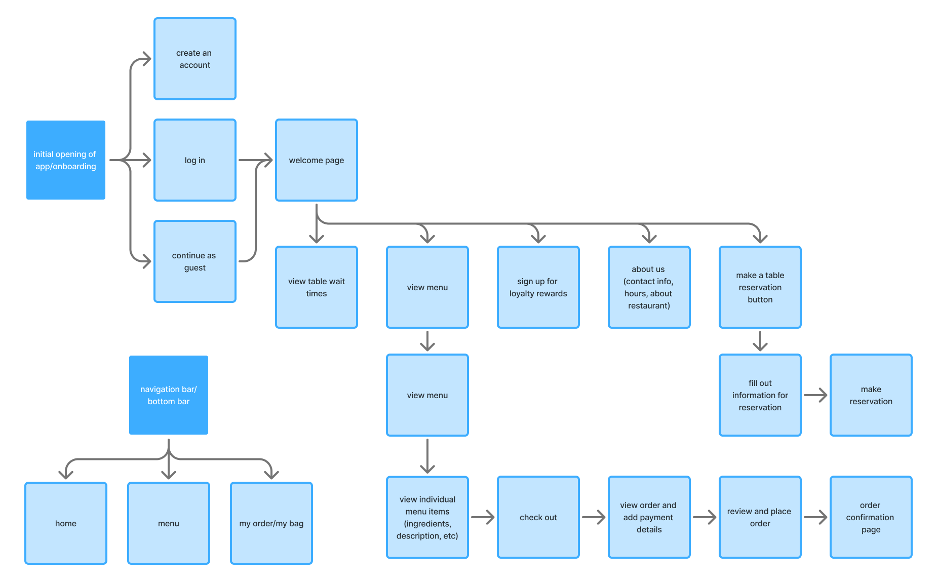
TASK FLOWS & IA PATTERN
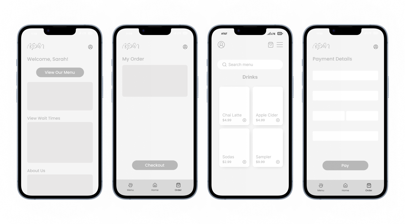
LO/MID-FI WIREFRAMES
Below are some of my early iterations from the beginning of the design process. To establish the overall layout, I started by placing simple shapes and buttons. Once I was satisfied with the structure, I continued ideating my incorporating text and more details. I kept everything in black and white at this stage to focus on layout and hierarchy without the distraction of color.
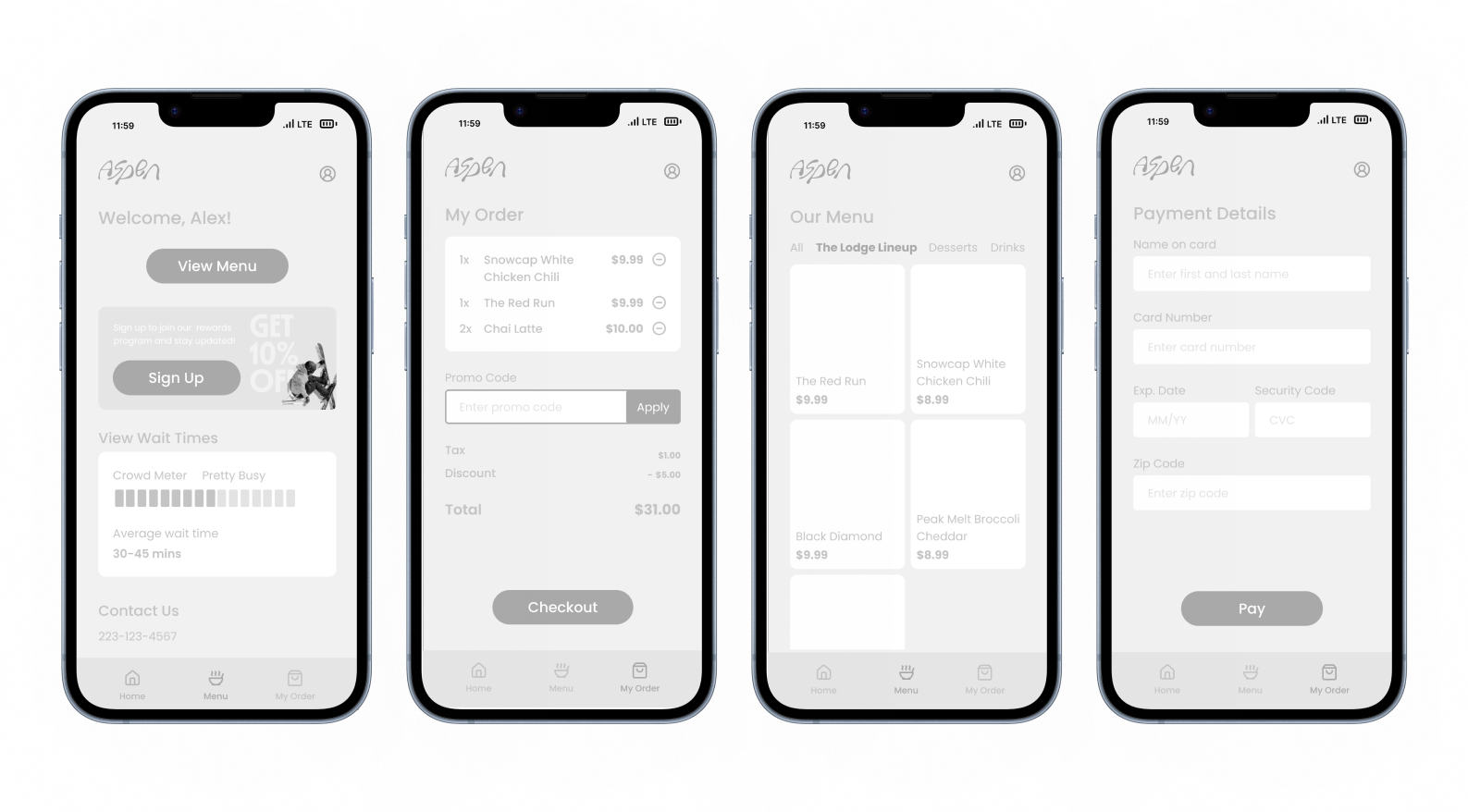
Revised Iterations
During the revision process, I added in color to incorporate the brand's identity. I originally chose the dark blue as the background and red as the call to action.
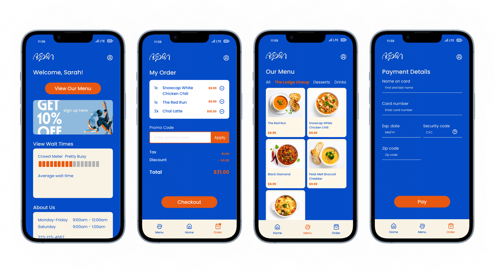
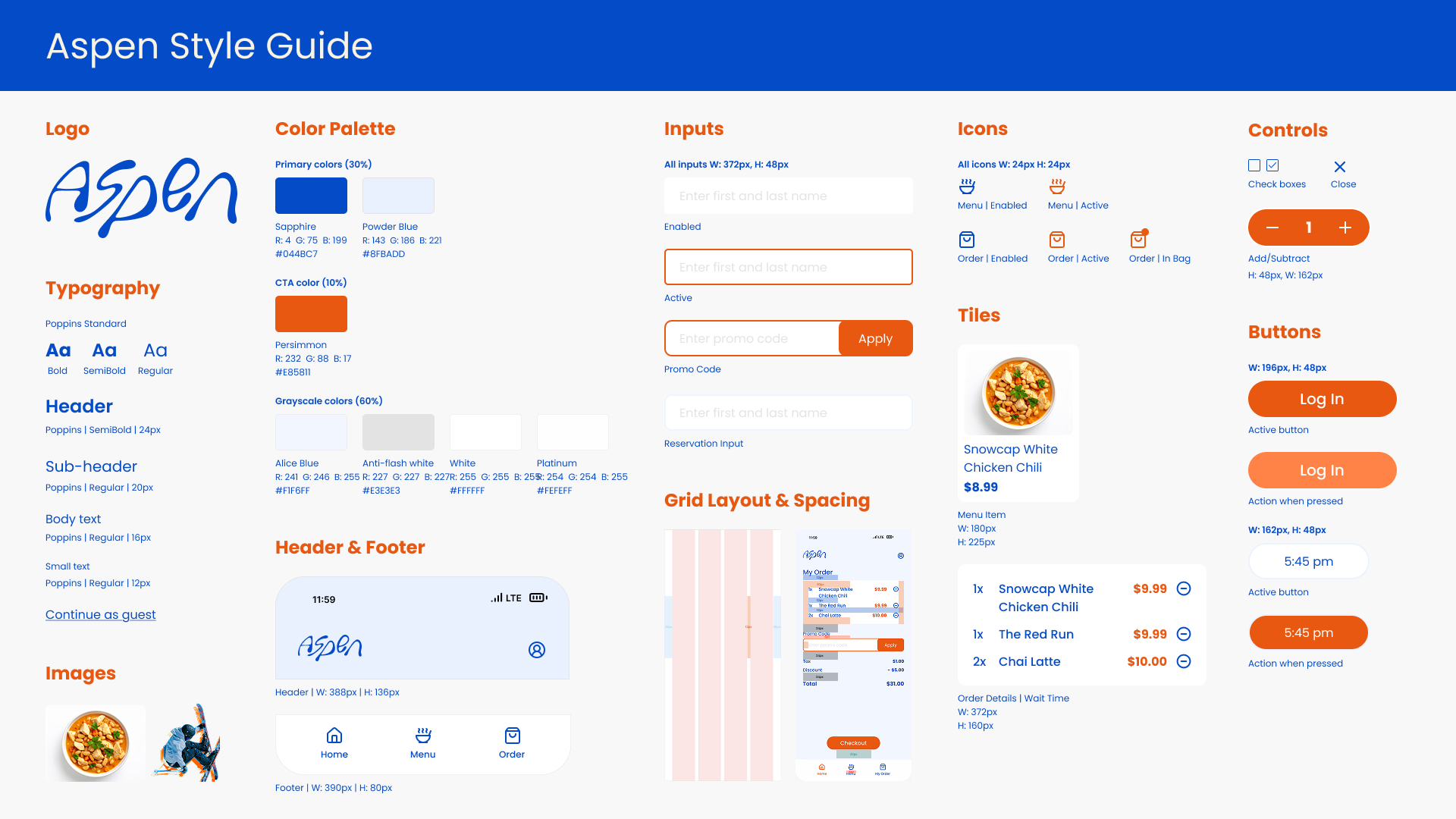
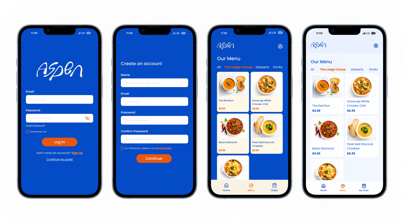
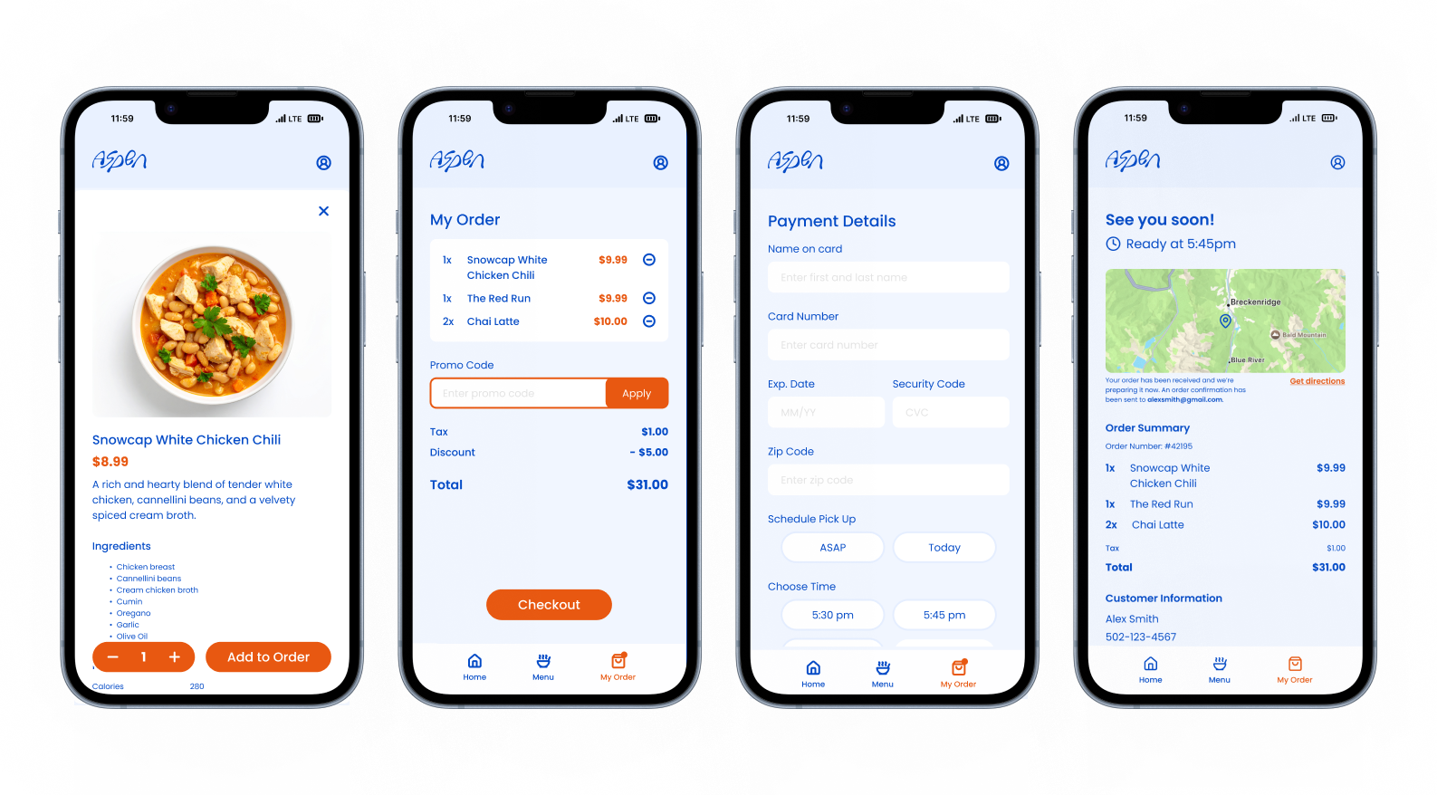
FINAL SCREENS & WALKTHROUGH
After much exploration, the final screens and style guide were developed. I refined the visual hierarchy to create a clearer, more intuitive flow, and updated the background to a light blue to give the interface a cleaner, more modern feel. These changes helped improve readability, reduce visual clutter, and tie the overall design together.